


1
Positioning

Download
Axioma
Metering
For the
real world
Positioning explained

Axioma Metering develops and manufactures products and services that are tailored to the real world and respond to real needs.
This approach embodies the company's commitment to meet customers' real product acquisition, installation, use and maintenance needs and at the same time ensure a smooth customer and user experience.
By focusing on essential needs and functionalities to satisfy them, Axioma Metering distinguishes itself as a company which provides straightforward, non-superfluous, effective solutions that resonate with customers' and users' need for practical usefulness and technological simplicity.
In this context, innovation efforts focus not on creating some utopian future world, but on meeting real-world needs more effectively, more durably and more easily.
Keywords
These keywords capture the qualities and characteristics of the Axioma Metering brand. They reflect the brand's tone of voice, visual expression and operating principles. The keywords can serve as a starting point, a source of inspiration, for creating internal and external communication materials and content.
Just what's needed
Real-needs innovation
Durability
Tailored
Usefulness
Real
Practical reality
Facts
Concreteness
Resilience
Functionality
Real
meaning
Here the positioning is seen as empowerment and encouragement of employees to create products with real value and impact. They can feel that their work is important and meaningful since they are contributing to solving real problems and to the welfare of the real world.

Employee perspective
For the
real world

Customer perspective
For
real needs
This is a commitment to deliver products and services that are designed around real, practical needs. We offer solutions that are not only high quality and efficient, but also easy to use and customise in a real-life setting.
2
Logo
Download
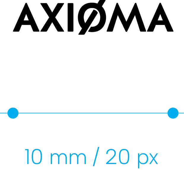
Primary logo
The Axioma Metering logo has one primary version.
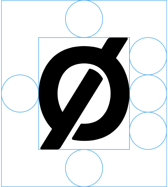
Symbol
Used in situations where the primary logo cannot be used or where it can be clearly understood that the content is from Axioma Metering.

Exclusion zone and size
The exclusion zone specified for the logo may not contain any other graphics or text. The exclusion zone is equal to 1/3 of the height of the logo or the symbol.
The logo can vary in size but should not be smaller than indicated in these examples. The version without the word "Metering" may only be used where lack of space prevents use of the primary version of the logo.


Use on backgrounds
The logo may be placed on a variety of backgrounds, but it is important to always use a suitable version and ensure good legibility. The colour of the logo may be black or white.
These rules apply to both the logo and the symbol.

Incorrect logo use
- Don’t use an old logo version
- Don’t change the proportions
- Don’t use an unauthorized colour
- Ensure the logo is clearly legible

- Don’t change the logo typeface
- Don’t use an incorrect colour
- Don’t use an unauthorized colour
- Don’t use an unauthorized colour

3
Colours
Download
There are four primary brand colours. The logo may be used in black or white. All four colours may be used for backgrounds.

4
Typography
Download
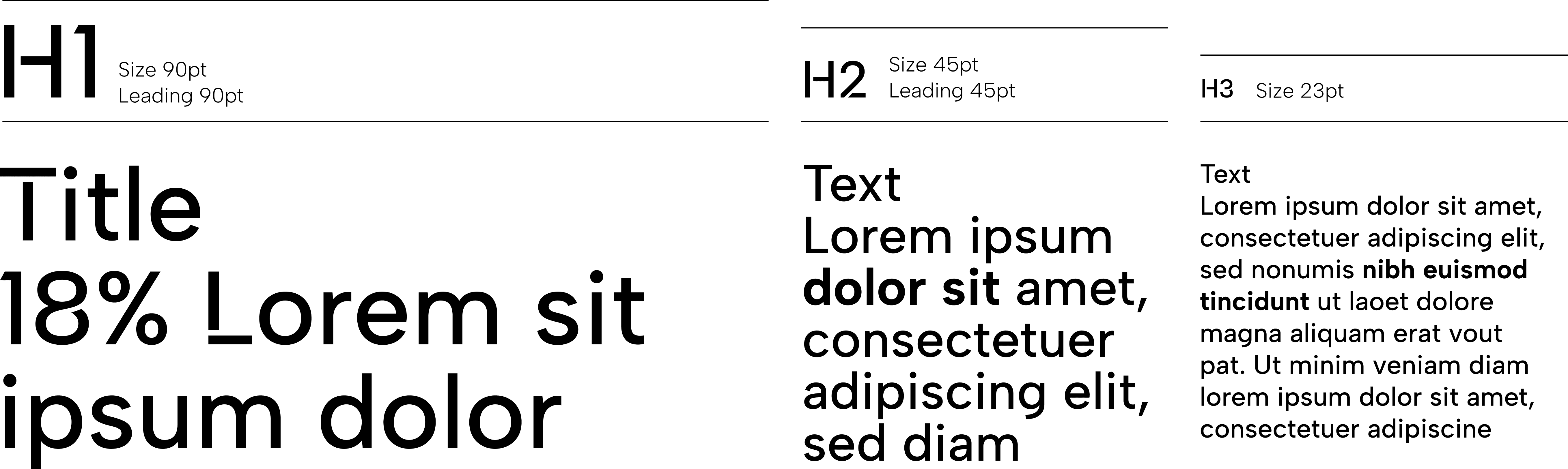
Primary typeface
The primary typeface is Albert Sans. Several of its font weights are used: Albert Sans Medium Title is used for titles, subtitles and numerals; Albert Sans Medium is used for ordinary text; and Albert Sans Bold is used to highlight content in ordinary text.
When for technical reasons the primary typeface cannot be used, the Arial Regular and Arial Bold system fonts should be used.

The following font size hierarchy is recommended to make sure that the most important information stands out.
5
Tagline
Download
Tagline use options
The tagline may be used with or without the logo and aligned with the top, bottom or left edge. The tagline can be used to fill empty spaces.

Examples of tagline layout
Minimum spacing between the logo and the tagline.

6
Numbers
Data
Download
Data blocks
Axioma Metering talks about itself, its achievements and its results with facts and figures. It uses several block formats to provide data.
In presenting data, numbers should always be written in Albert Sans Medium Title type.
Blocks can be placed freely in various places within a layout
Blocks can be included in a shape with lines that stretch across its full width or a clear part of it.
Blocks can be included in a shape with lines that stretch across its full width.


When a fact is written as a complete sentence, it is recommended that the number and unit of measure be twice the size of the main headline text.


7
Photography
In selecting photos, we should always show real employees, their work processes and what they make. Photos are divided into 2 groups:
Illustrative photos – showing a work process;
Personal portraits – showing employees.
Illustrative photos
Multi-layered, dynamic, natural. Subtle tonal streaks of light seemingly symbolise particles streaming through a meter.
Personal portraits
Warm, bright people posing. Black and white photos, but without excessive contrast. Large dark areas in clothing should be avoided.

8
Pictograms
Download
Very simple line pictograms enclosed in a circle are used.
Basic
Functional


9
Applications
Download
This section offers examples of how the elements of the visual identity are used in different contexts to achieve coherent communication.


Here’s to
well done work!
For any questions, contact metering@axioma.eu
© 2024 Axioma Metering
The visual identity works only in the desktop version. Please open this link on your computer or enlarge your browser window.